
Logos & Branding
A logo is the centerpiece of a strong brand! blazar design studio delivers bold, modern logos that represent each organization in their own light. My goal is to capture the essence of your company, create a story for your branding, and to always keep aesthetics and functionality front and center—often logos have both a horizontal and vertical option for ease of use. I also create mini brands for galas or capital campaigns. Scroll below for a sampling of logos, and please roll over the logo to learn more.
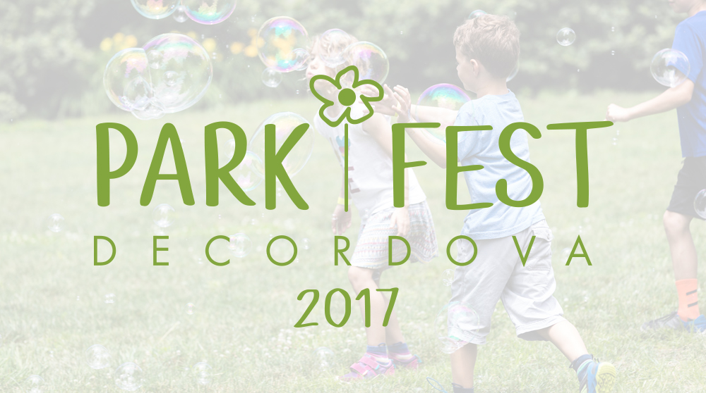
ThIS logO, Designed for PARKFEST (a child-friendly event held EACH SUMMER at the deCordova) IS INtended to bE whimsical and fun.


This ships prow, shown in a square box and moving through the water, uses clean lines—reflecting Scandinavian design—with a fresh and dark blue (or red for a little more pop in the cultural center), combined with a modern font.
The prow symbolizes both the passage of time and traditions, as well as the continuing uplifting journey through life. More abstractly the icon has been said to resemble the Zakim bridge—establishing both their location in the Greater Boston area and symbolizing a connection between different people. The new logo embraces a fresh, modern, easily manipulated design while honoring the organization’s Scandinavian heritage.

ThIS Logo showcases an illustration of a tree on deCordova’s grounds — representING a society for those who have given generously and are considered a “Friend of the Park.”

The visual identity for this organization was designed in tandem with a rebrand that also included a new name. ThE logo contains an abstract and generic “family” of four icon, in which the family shapes are also the shapes of Key HOles, representing access. The fonts combine a welcoming informal script with a bold san serif, the latter of which is an acronym for “A Center for Comprehensive Education and Support Services.

This logo, designed for a boutique photographer in New York City, uses overlapping bold letters to form a strong graphic with great impact.
Often combined with a navy stripe, the branding is unique and stands apart in the market Sarah competes in. At the same time, the logo doesn’t compete with her main focus - the photographer’s subjects!

Fleuri creates elegant florals and container gardens in both residential and commercial settings, and as such wanted a simple geometrically based logo that would go with any flower, greenery or color. The simple repeat of abstract budding flowers with spaced lettering is memorable and modern ... just like the designs Fleuri produces.

A fun and whimsical logo with rich and warm colors, this ONLINE stationery shop wanted a text based logo to compete in a saturated—and sometimes over designed—New York City market. The logo needed to render both large and small and truly standout ON the main event: their website.

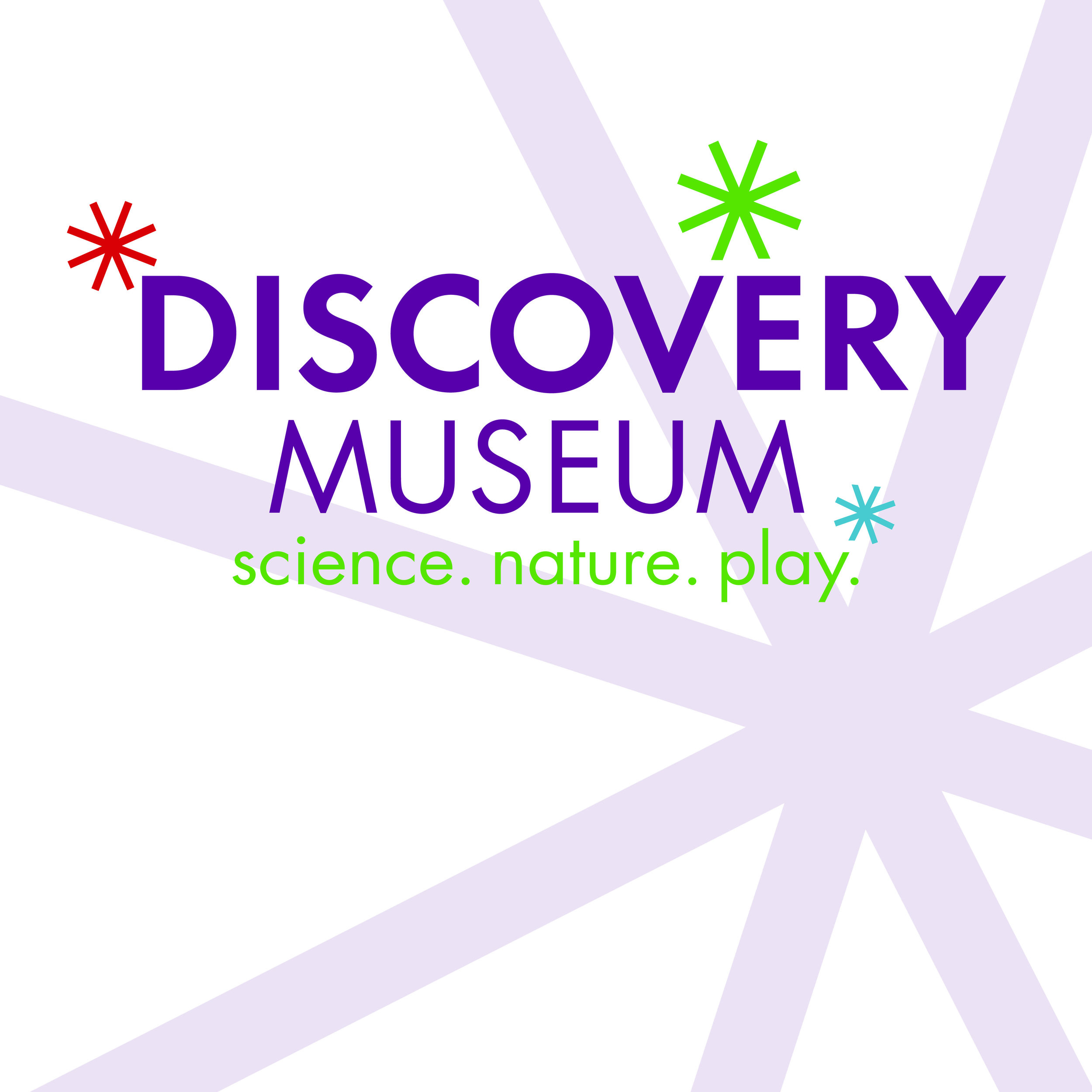
This new Discovery Museum logo visually represents a changed and expanded experience; the use of sparks suggests a mindful evolution from the old logo to the new. The sparks themselves represent the museum’s long-standing mission to spark discovery and learning through hands-on inquiry and scientific investigation. A refreshed color palette offers a more broad and mature - yet still fun and playful - look.

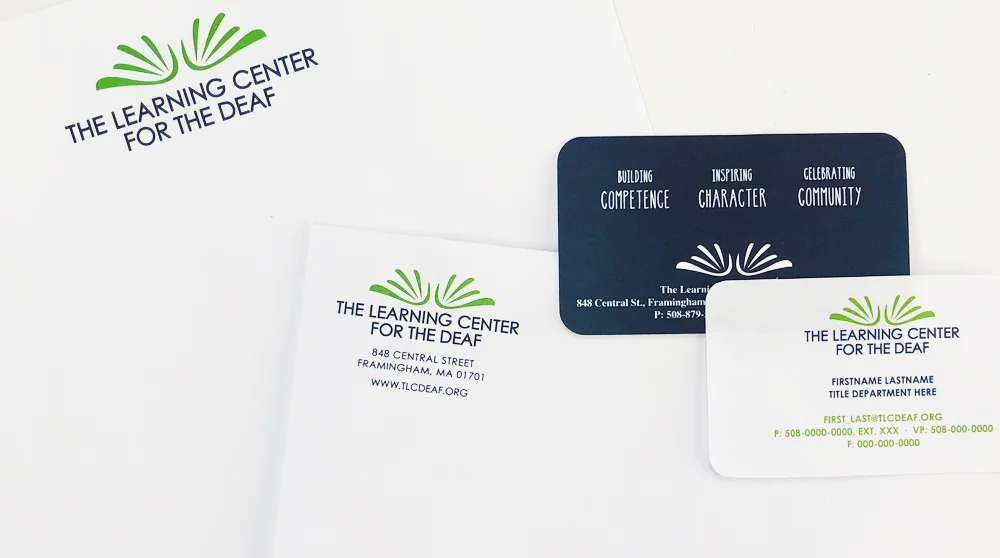
This logo holds many meanings—an abstraction of the ASL depiction of the sign for “inspiration,” it captures the impact on those enriched through the services they receive from TLC. The logo also symbolizes the following: hands waving, a sign expression for applause and celebration; the TLC Sign Name “I Love You”; books, the gateway to the English Language; and finally, a butterfly, an animal believed to be deaf and a symbol of the deaf community in many countries.


"Designed an eye-catching new logo."
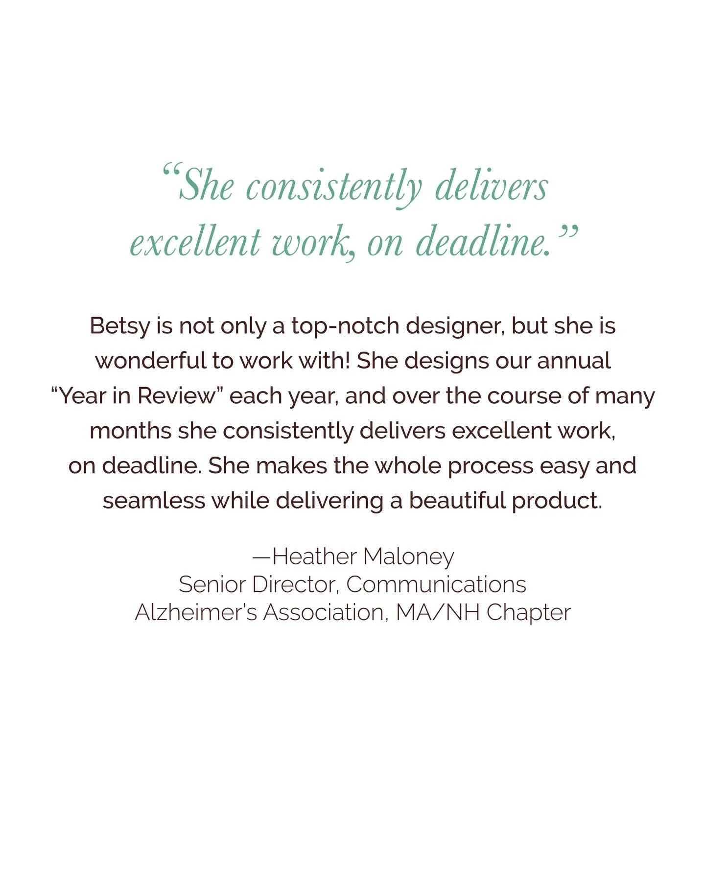
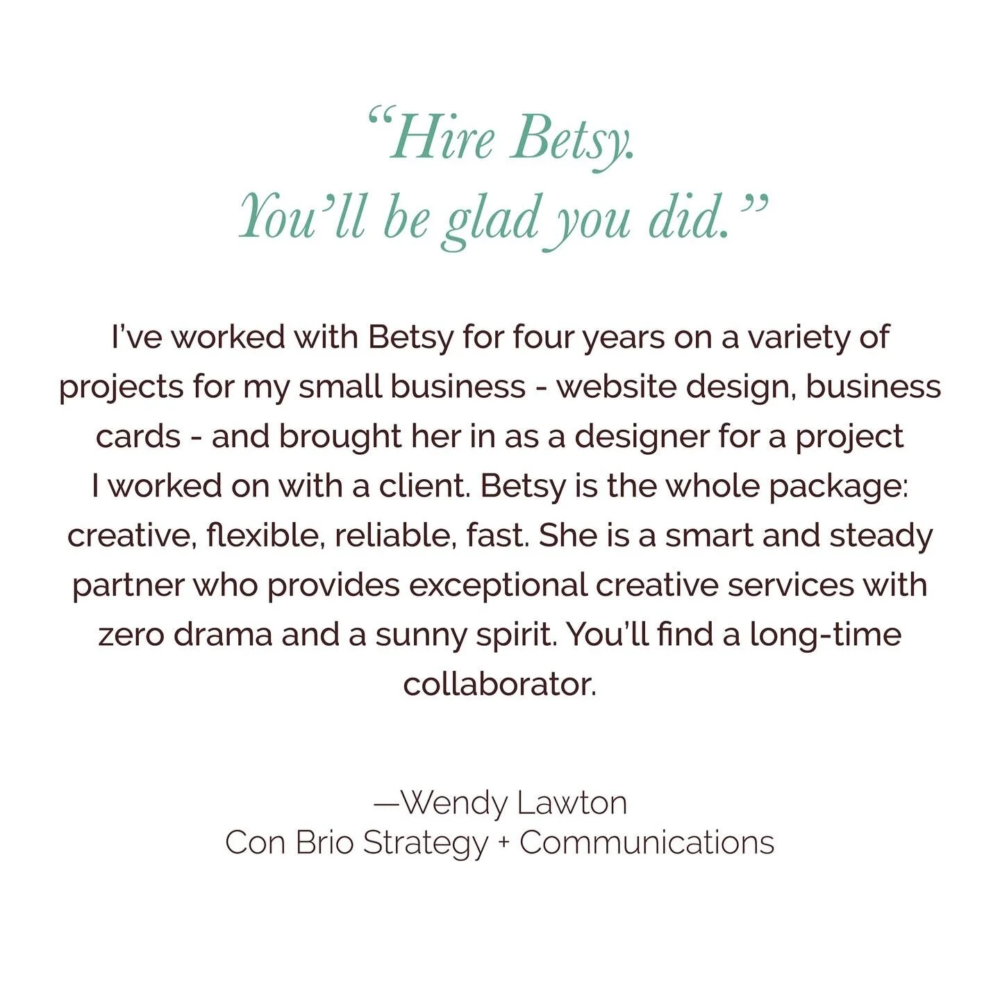
Hiring Betsy for our rebranding project was an exciting and productive experience. For our 100 year-old organization, she designed an eye-catching new logo and marketing materials that now accurately reflect our current message and what we want people to associate us with. Although our group had so many different opinions, she was very patient, professional, and creative and ended up satisfying all of us, including our board of directors. I would certainly recommend her to any business in need of updating its look and messaging.
— Carol Chudnofsky, Marketing Director, Scandinavian Living Center


"The details are not the details. They make the design."
—Charles Eames

"Patient and attuned to detail."
Betsy has an intuitive understanding of our organization’s brand and successfully translates that into the visual tone of our graphics and marketing materials. From long term projects to those that require a fast turnaround, Betsy is patient, attuned to detail, and always wants the product to be just right, even when that means accommodating our millionth last minute edit.
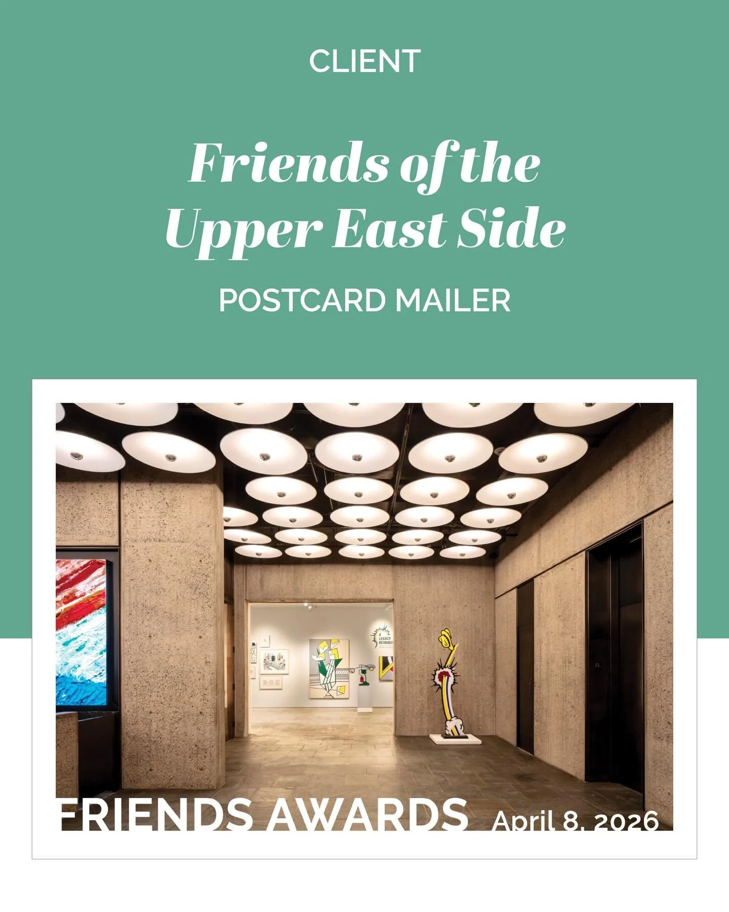
—Rachel Levy, FRIENDS of the Upper East Side Historic Districts
Offerings Include
Brochures
Magazines
Viewbooks
Invitations
Appeals
Logos
Event Suites
Websites
Advertisements
& More!